UX design, especially conceptual design, is where the foundation for successful digital products is laid. If essential things are disregarded here, this has serious consequences for the further development steps. In the worst case, a lot of time and money is burned.
However, if you avoid the following UX design mistakes, you’ll save yourself, the designers, and development a lot of time.
Error 1: Start directly with the visual design
Impact: More time required
Imagine you want to redesign your website or app and you start right away with the visual design. You take an incredible amount of time to implement and when it goes into feedback or directly online, it turns out that your ideas don’t quite pan out. So start over…
Wireframes are a good intermediate step, because they give you the opportunity to efficiently capture your ideas in order to get feedback from users and other stakeholders early on.
Therefore: Never skip wireframes! They enable an iterative conceptual design process.
We recommend the following procedure for new products:
- Scribbles (hand-drawn page sketches)
- Rough concept (wireframe, e.g. created with tools like Axure or Balsamiq, which roughly depicts main content/page structure/user interactions)
- Fine concept (wireframe, e.g. with tools like Axure or Balsamiq, which already depicts the website in great detail, but without visual design)
- Prototype without visual design (preliminary versions with basic functionality – “click dummy”)
- Mockup/Design
- Prototype with visual design (preliminary version with basic functionality and visual design)
However, for existing or low-complexity products, individual steps can be omitted. At the latest, the prototype without visual design should be subjected to usability tests in any case.
For example: If the checkout of an existing online shop is to be optimized, the rough concept could be omitted. Depending on the extent of the optimizations, you may also no longer need mockups or a prototype with design. The prototype without visual design should be evaluated in a usability test and if the results are satisfactory, the developers can implement it directly in the existing design.
Here you can find out more about which conception process we recommend.
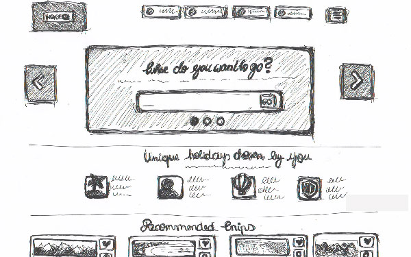
Example of the result of a scribble session

The website in final design
Error 2: Do not use a grid
Impact: Additional effort in later process steps
Use a grid already in the rough concept, i.e. a system to which you align all elements of the website. This saves you the additional effort in the fine conception and guarantees a uniform appearance of the different pages at an early stage. They prevent the need to make fundamental changes to the layout at a later date. It also makes the work of the designers and developers easier, because they only have to transfer the concept into the design or the code.
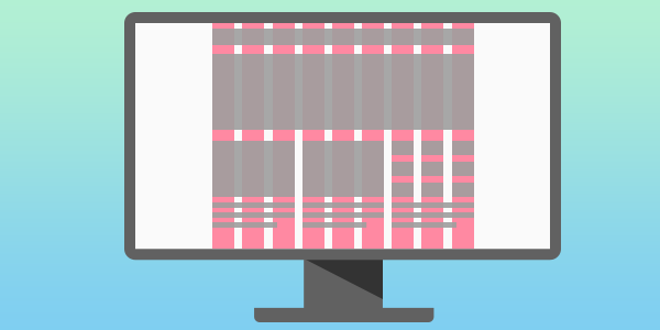
Example of the grid system of a website
Tips for choosing the right grid:
- In most cases, it makes sense to choose an even number for the number of columns (e.g. 12, 16 or 24), as this allows the layout to adapt particularly well to different viewport sizes in the course of a responsive web design.
- Usual total widths are 960 and 1140 px, whereas 960 px are no longer up-to-date and the new 1140 px grid is ideal for current screen sizes from 1280 px. Wider layouts do not make any sense because the user then cannot see the entire width of the page at a glance.
Mistake 3: Use unrealistic content
Impact: Greater time expenditure or loss of informative value
Lorem ipsum dolor sit amet, consetetur sadipscing elitr, sed … If you write ‘headline’ everywhere in the concept instead of using realistic headlines, you run the risk of neglecting important requirements that the content places on the layout. In the worst case scenario, you don’t realize that the actual headings don’t even fit in the designated area until you’re entering the content.
What now? Throw the whole layout out of the window or shorten the headlines and make them less meaningful? Better to work with real text content from the start.
It doesn’t have to be the final content yet, but it should be realistic in terms of length and scale. It is the same with image content. Instead of placeholder boxes, you should work with realistic sample images. This allows you to test early on whether the images work in a particular format (for example, portrait or landscape, square or circle) and support the message or function of the page.
Error 4: Forget about mobile (or desktop)
Impact: Loss of sales on the disregarded device
Nowadays, websites must also function well on mobile – of course, this is no longer a secret. However, it is still often forgotten that the various devices should be taken into account at the design stage. By the way, it doesn’t matter if you follow the mobile-first approach or not. Different devices use different screen sizes and interaction styles, which should not be ignored.
Error 5: Disregard design principles
Impacts: Greater time required or loss of usability.
When designing websites and apps, you should be familiar with key design principles, especially to create a visual hierarchy. The most important information on each page should be clearly highlighted. If you follow basic design principles at the conception stage, you will save yourself and your designer a lot of time.
Design principles that have to be considered already in the concept:
- Low layout complexity: A layout that is as simple as possible allows users to find the information they are looking for much faster.
- Visual hierarchy: It’s quite simple – what stands out, for example. by size, color, contrast or spatiality, people usually see first. Therefore, highlight the key information.
- Grouping: This design principle is composed of proximity, connectedness and similarity. Elements that belong together in terms of content should also be linked visually, for example through their arrangement, headings, background, frames and spacing. Only then will they be perceived as belonging together.
- White space: The omission of elements is also a design principle. It visually separates objects from other objects, thus giving them order and making them easier to grasp.
- Simplicity: Keep it simple! – The best interface designs are often almost “invisible”, so unnecessary elements should be avoided.
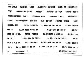
without design principles
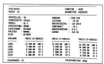
with design principles
Error 6: No user-centered design
Impact: Poor user experience and consequent loss of revenue.
Even if you’ve sought regular feedback from your peers during the design process, you may still have left your users’ perspectives out of the equation. In this case, you probably won’t know how your users are taking to the new website or app until you go live – and in the worst case scenario, you’ll be terrifically wrong.
That’s why you shouldn’t rely on gut instinct even for micro-decisions. All design decisions must be aligned with core principles and validated against personas, scenarios and use cases.
Together with usability tests of the wireframes and the prototype, you can be sure to develop an interface that is tailored to the user and his tasks and needs.
Error 7: Conception without user feedback
Impact: Poor user experience and consequent loss of revenue.
Even though it’s already been mentioned a few times, this point deserves its own section: never design without user feedback! Our own perception can blind us quite a bit, and in case of doubt, it does not correspond to the view of your users.
Therefore, to avoid developing your product past your customers, keep the following things in mind:
- Do not do rough drafts alone: In any case, conduct the first scribble session with at least two people. All parties involved must have a common understanding of the product and its users ( personas help here).
- Keep gathering user feedback in usability tests throughout the process.
- Also, get internal feedback regularly to incorporate new perspectives.
Error 8: Disregard different states
Impacts: Increased time or loss of usability.
Often it only becomes apparent during programming that essential states of the interface were forgotten during the conception, which leads to unexpected additional work.
What you must not forget in any case during the conception:
- Error messages: Sometimes people forget that a screen must also display error messages. These must be conceived and designed.
- Blank screen state: Especially when developing tools, it is often not considered that a screen must also be designed for the blank state (e.g. for the beginning of the use of a tool).
- Other states: Hover and disabled states, but also intended micro-interactions should already be considered in the concept. For example, it is useful for form screens to display all states in one screen.
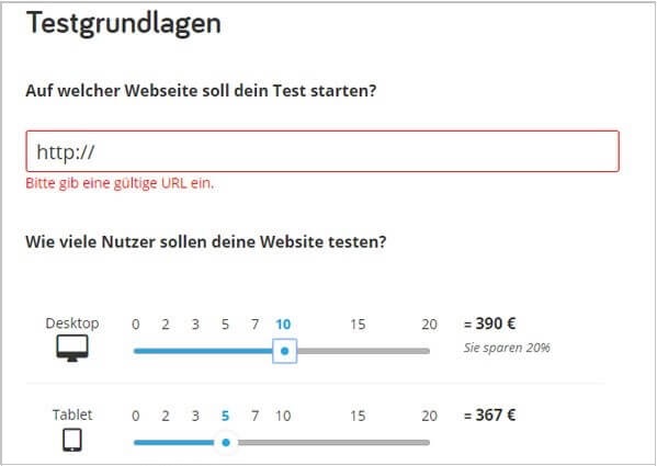
Error message in our booking form
Now, let’s go: Let’s go into practice! If you avoid these mistakes, nothing will stand in the way of a successful conceptual design project.
If you are still unsure about how best to approach the development of your digital products, we will be happy to assist you with the conception of a prototype or with interface design.
In a conception project for Magine TV, for example, we were able to increase the conversion rate of the prices page by 40%. How? Read the case study here.


Share
Share this article