
Looking at how the new sofa looks in the living room before you buy it? Try on the jeans without having them shipped to you? AR apps now exist for both. Step by step, augmented reality is becoming part of our everyday lives.
In the industrial sector, on the other hand, it has been indispensable for some time: for example, it facilitates the repair of elevators and in large factories it provides a quick overview of current production processes.
Nevertheless, devices such as the Microsoft HoloLens are a new category of devices with which users are still hardly familiar – operating principles are foreign to them.
There are still no conventions for the design of AR apps
While conventions of use and design have developed over the years for websites and apps on familiar devices such as laptops and smartphones, there are no conventions yet for augmented reality devices.
Since the user cannot yet rely on traditional operating principles, apps for these devices must be ESPECIALLY easy to use in order to compensate for the initial difficulties.
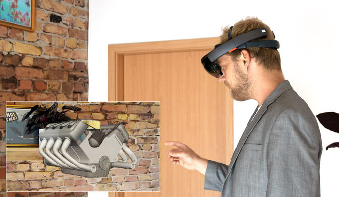
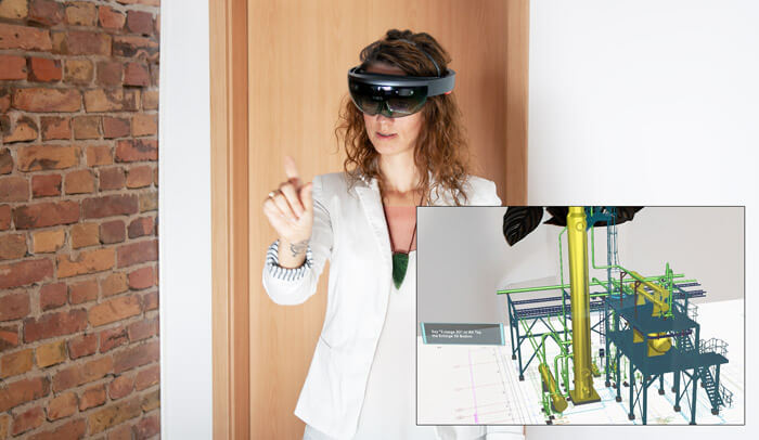
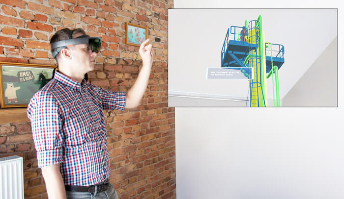
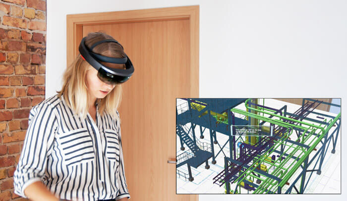
We tested several industry-related AR apps, observing both the behavior of the test subjects in the room and in the app. We used the Microsoft HoloLens for this purpose. Strictly speaking, then, this was a mixed reality trial, as users wear glasses similar to virtual reality, but can still see their real surroundings, as with augmented reality.
In these tests, we were able to identify some recurring patterns and derive the following best practices:
Onboarding the user
Most AR apps tested didn’t give users an introduction, but put them right in the middle of the action – without any assistance at all. Even in apps for traditional devices, this is already a usability faux pas.
In a 360° room, however, orientation is even more difficult for the user than with conventional software or devices because the user interface extends beyond the boundaries of the display. He therefore needs much more time to examine his environment and assistance to find his way around.
Many users reacted overwhelmed – they usually lacked the most basic info: “What can I do here?”
Best Practice:
Provide introduction: The user should receive a short introduction about the possibilities of the augmented reality app and its operation at least at the first start. Thus, he is not thrown into three-dimensional space without assistance.
Explain the gestures for operation
Many users do not know which gestures they can use and what they do because they lack hints or short tutorials that illustrate the gestures. Especially when it came to more complex interactions, users sometimes found out what they needed to do to achieve their goal only through tedious trial and error.
Best Practice:
Explain gestures: While the user is performing a task, he should always be shown which gestures he can use and which functions are triggered by them. Pictograms are suitable for this purpose, ideally animated, at the beginning or permanently during a work step.
Include the user’s field of vision
In our tests, it often happened that users did not see important elements, such as opening windows or notices, because they opened in the three-dimensional space behind them and thus outside the field of view.
In these cases, the users usually have no (visual) indicator that they would have to turn to the element. In addition, new elements often appeared in arbitrary positions, which users perceived as unnecessary and incomprehensible.
Best Practice:
Stay in the field of view: Important content should always appear in the user’s current field of vision, so that the user does not have to search his surroundings for it. Alternatively, arrows on the edge of the screen should be used to indicate the direction.
Optimize size ratios
Often the objects displayed in augmented reality are much larger than the space in which the user is located.
Since they do not have the possibility to move far enough within their real space and to change the perspective, the users are often too close to the displayed elements.
As a result, users quickly lose track of the objects and are sometimes unable to interact with them appropriately because they are obscured by an awkward perspective.
Best Practice:
Test size ratios: The AR app should definitely be tested in smaller rooms to ensure that the AR objects are not displayed too large. In addition, the user can be given the chance to adjust the size factor at the beginning of use so that everything fits into their own four walls.
Matching audio and visual
Tests have shown that users are quickly overwhelmed when several sensory channels, mostly vision and hearing, are not optimally combined. This happens whenever, for example, a voice passes instructions or information that does not exactly match the content in the field of view.
In this case, users wait for the announcement to be repeated or simply disregard the instructions.
Best Practice:
Use audio announcements only as a support: Audio announcements should only be used in conjunction with visual cues, as they are easily forgotten or overheard. Ideally, they should be offered as a supplement to text.
Guiding the user through tasks
Often, users are not clear on what they need to do to meet their current goals. Audio instructions were sometimes either overheard, not properly understood, or simply forgotten. In situations where users have to perform tasks, e.g. marking and selecting an object, there is often a lack of permanently visible cues to guide the user.
Best Practice:
Make hints visible: The current step that the user needs to complete to reach their goal should be visibly displayed to them, at least as a new user initially. This provides orientation and assistance when the user is overwhelmed. A short sentence at the edge of the display is usually sufficient for this.
Highlight what is important: Objects or elements that are relevant to fulfilling the user’s current goal should catch the user’s eye. This can be achieved, for example, by using an eye-catching color and, if possible, animations such as pulsing or lighting up.
Identify weaknesses at an early stage through testing
Even though the problems identified in the test seem very specific to augmented reality apps, the bottom line is that they point to common usability problems that plague users.
Just as with all other interfaces, the user must be able to answer these questions at any time:
- Where am I?
- What can I do here?
- How do I achieve my goals?
As the possibilities of augmented reality are just beginning to unfold, and there are few good role models for AR app developers, it’s even more important to refer back to these basic usability questions. Here it will be exciting to observe which conventions will prevail.
With the help of user testing as early as possible, these potential vulnerabilities can be identified accurately. (Of course we are happy to support you 😉 )
")


Share
Share this article