
When products underperform in the DACH market, the reflex is often the same: “The market is tough.”
In our experience, this explanation rarely holds up.
Some products and campaigns that perform well internationally show lower conversion rates in Germany, Austria, or Switzerland (DACH region) — not due to a lack of demand, but due to different user expectations and behaviour. It is visual hierarchy, trust signals, tone, and the subtle cues that tell a user “this is legitimate” or “something feels off here.”
The DACH market is not necessarily difficult.
More often, it is simply different.
The key to addressing these differences lies in UX localization: adapting the experience to the specific needs and expectations of local users.
What UX Localization Is – and What It Is Not
UX localization goes far beyond translation. It starts much earlier and affects the entire customer experience regarding cultural habits, legal norms and emotional expectations.
From button wording to humour, from data privacy to visual hierarchy – UX localization makes sure that products and campaigns feel right for users in a specific region.
True UX localization means adapting:
- language and terminology
- interaction patterns
- visual hierarchy and information density
- trust signals, compliance cues, and tone of voice
How do we know this?
The insights in this article are based on our day-to-day work as a UX agency in Berlin, Germany.
We run over 3,000 UX tests and interviews per year, many of them with users in Germany, Austria, and Switzerland; often for international products entering the DACH market.
With our own panel of 50,000+ DACH users, we’re able to validate recurring UX patterns and cultural expectations.
This experience forms the foundation of our UX localization services.
5 UX-Related Reasons Products Fail in the DACH Market
Many products don’t fail because they are poorly built. They fail because subtle details in the user experience clash with local expectations – and those mismatches directly affect trust, credibility, and conversion.
1. Cultural Expectations and How They Shape Perception
To understand why UX experiences land differently across markets, two frameworks are especially useful.
Hofstede’s Cultural Dimensions Theory compares nations across six core dimensions – from how much people tolerate uncertainty to how individualistic a culture is. These dimensions aren’t stereotypes. They’re aggregated patterns that help explain why users from one region might scan differently, trust differently, or expect interaction patterns that don’t compute the same way elsewhere.
Germany scores 65 on uncertainty avoidance — relatively high. That single data point has direct UX implications: German users tend to prefer clear structure, predictable navigation, and explicit reassurance at every step. It shows up in how they respond to vague CTAs, ambiguous error messages, and checkout flows that leave too much to interpretation.
If you want to dive deeper into the different cultural dimensions, this is a fun tool to play around with: Cultural Comparison Tool
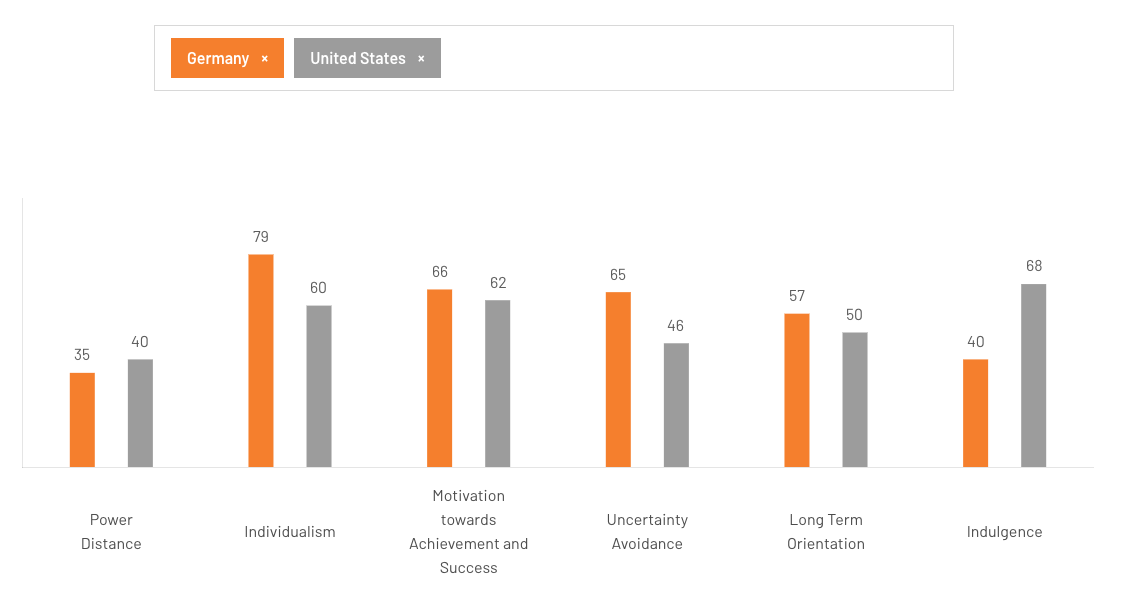
Compared to the US, Germans tend a lot more towards uncertainty avoidance and a lot less towards indulgence. (Source: The Culture Factor)
Edward T. Hall’s high- and low-context framework adds a second, complementary layer — and it’s particularly relevant for visual design decisions.
In high-context cultures, meaning is embedded in the environment: the visual density, the relationships between elements, the context surrounding a message. In low-context cultures, meaning is expected to be explicit, direct, and foregrounded. Japan is one of the most high-context cultures in the world. Germany is one of the most low-context.
That difference explains something you can see immediately by opening two comparable online marketplaces side by side.
Open Rakuten — Japan’s largest online shop — and you’ll find dense columns of text, stacked promotions, and competing visual elements across the entire page. To a German user, it can feel overwhelming.
Now open Otto, its German equivalent: structured layout, clear hierarchy, generous white space. To a Japanese user, it can look unfinished — like the page hasn’t loaded yet.
Neither is a design failure. Both interfaces are doing exactly what they’re supposed to do for the users they were built for. The visual language itself carries meaning — and that meaning isn’t universal.
This is also the kind of feedback we’ve heard directly in localisation tests with users from Asian markets: a restrained Western interface reads as incomplete or even broken.
2. Missing Trust Signals and Compliance Transparency
Users in Germany, Austria and Switzerland expect clear signals of legitimacy:
- visible privacy and data protection information
- legal transparency (imprint, terms, compliance details)
- a serious and reliable overall impression
If these signals are missing or hard to find, trust erodes quickly – often before users even engage with the core value proposition.
An example from our thousands of UX tests and interviews in the DACH market:
When visiting a new online shop for the first time, users surprisingly often check the imprint (“Impressum”). They look for company details such as the registered address, legal entity, and tax information to assess two things:
- Whether the business appears legitimate at all.
- Whether the product quality is likely to be trustworthy.
Claims like “American quality” paired with production in Vietnam and a company registration in Panama can quickly raise red flags for German users.
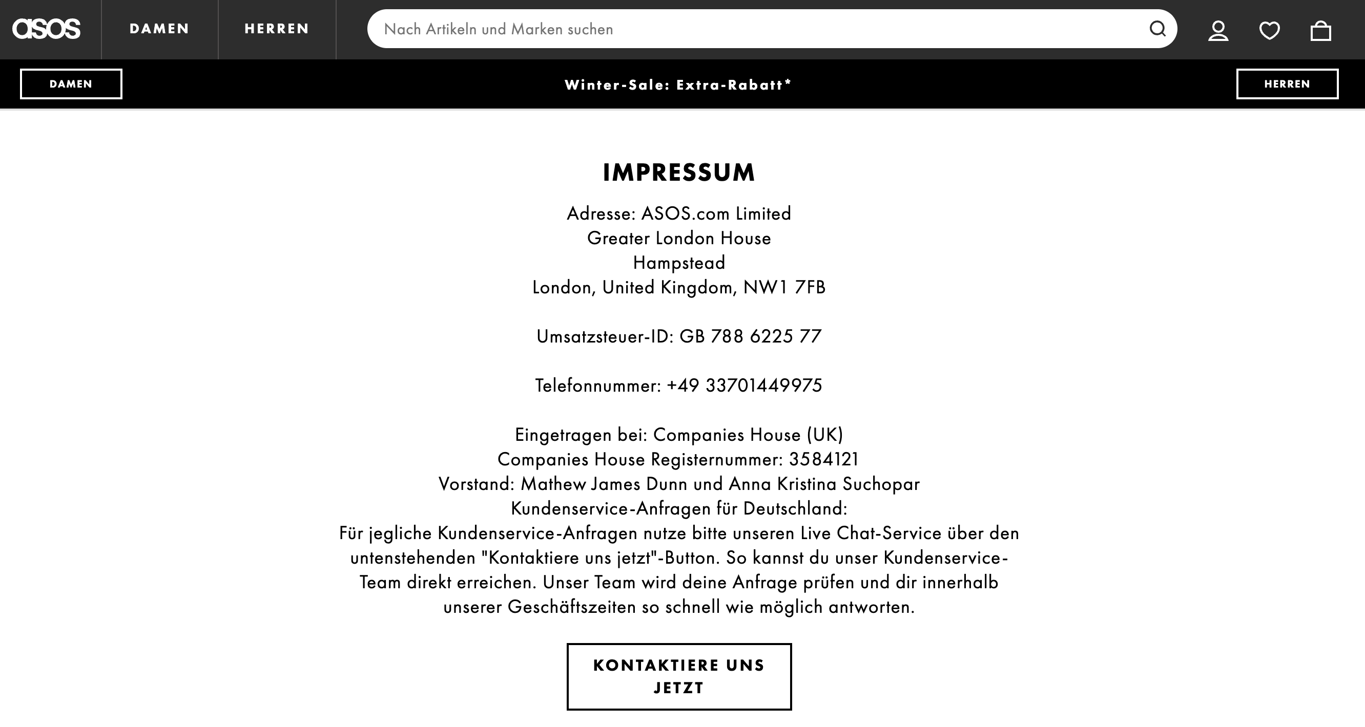
In Germany, an imprint is legally required and actively checked by users as a signal of legitimacy and trust (example: asos).
3. Overly Emotional or Sales-Driven Messaging
Messaging styles that work well in other markets can feel exaggerated or untrustworthy in DACH.
Common friction points include:
- heavy use of superlatives
- vague promises without evidence
- aggressive calls to action early in the funnel
Users tend to prefer precision, clarity, and factual arguments over emotional persuasion. This influences copywriting decisions as well as UX flow and structure.
However, this doesn’t mean that brands must abandon their personality altogether.
There is room for light, well-placed humour and emotional messaging — for example in microcopy, icons, or alternative labels for elements like the shopping cart — as long as checkout flows remain clear, secure, and unambiguous.
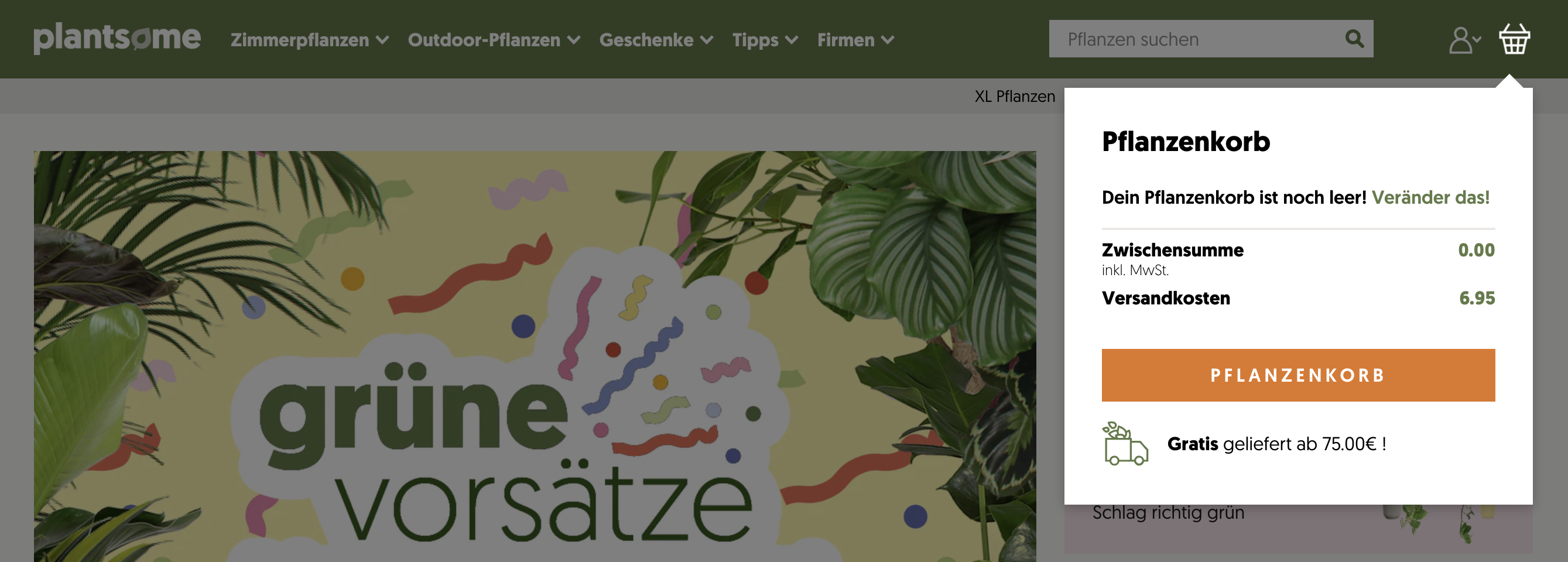
Plantsome is calling their shopping cart “Pflanzenkorb” (engl. plant basket), giving their brand some personality while still ensuring a clear checkout process. Their plant finder is also sprouting with emotional messaging while helping the users find the perfect plant.
Users from Germany, Austria and Switzerland want to understand exactly what will happen next, what they agree to, and how the transaction works, without interpretative effort or marketing ambiguity.
In short: In the DACH market, clarity and certainty come first. Brand tone should support the purchase process, not compete with it.
4. UX Patterns That Conflict with Local Expectations
Certain interface patterns regularly cause friction and can lead to disproportionately high drop-off rates.
Visual styles that feel either too playful or too minimal
Users in the DACH market generally appreciate calm, structured interfaces with clear hierarchy and sufficient whitespace. However, too minimal can become a problem depending on the product context.
A highly reduced interface may feel appropriate for a premium water filter showcased in a modern kitchen, but the same level of minimalism can make a bookshop feel empty and cold.
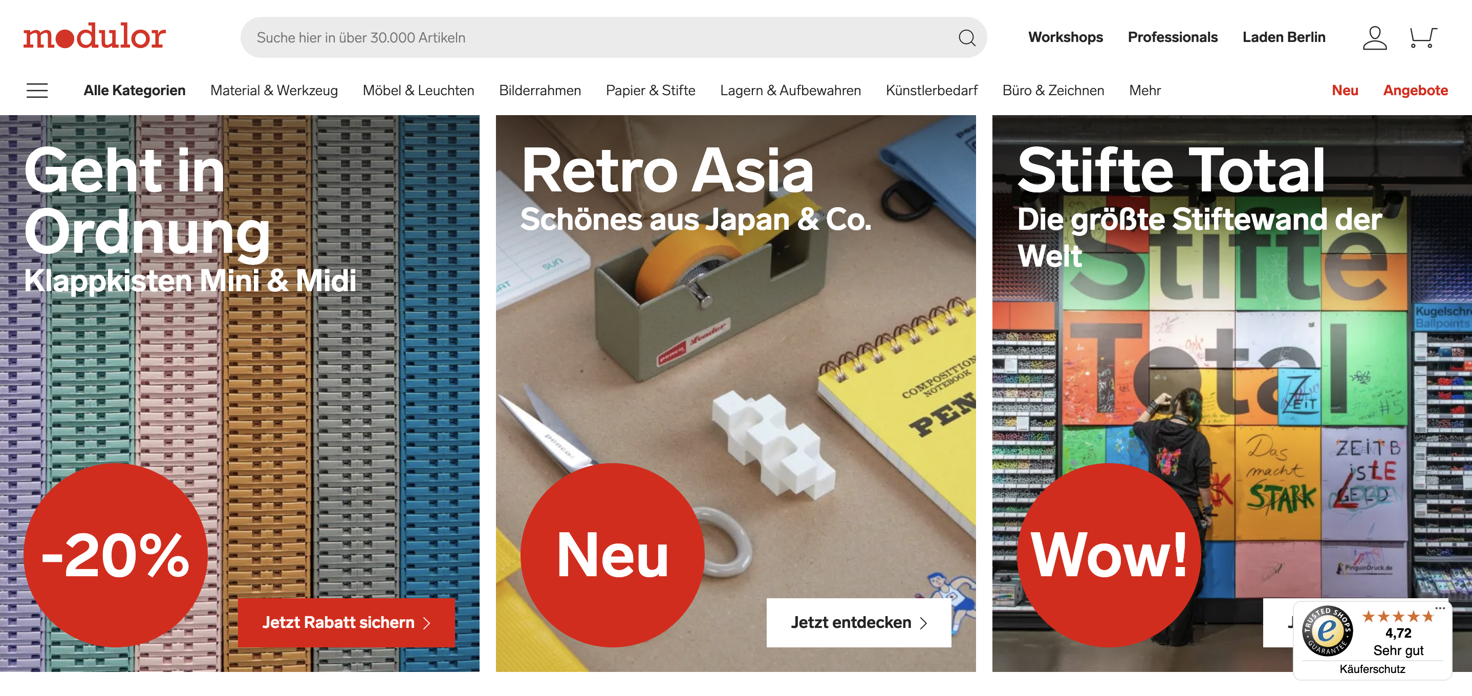
Art supply shop modulor strikes the perfect balance between a clean, minimalist interface and a colourful, creative design that is fitting for its crafty target audience.
Missing explanations where users expect reassurance
For example, CTA labels like “Buy now” can create uncertainty because they sound too final before the user had time to properly check one last time that everything is correct. German users like to have one final final review or confirmation step before they complete the purchase.
Badly phrased labels or error messages can create more confusion instead of confidence.
In these moments, users expect precise wording that reflects what will happen next.
In the DACH market, control and confirmation matter more than speed or surprise.
UX patterns should reduce uncertainty — not introduce it — especially in decision-critical moments.
5. Missing Cultural Validation in Product Decisions
One of the most common traps is relying on assumptions instead of local user insight:
- global UX patterns rolled out without validation with local users
- A/B test results interpreted without cultural context
- optimization focused on the wrong metrics
The underlying issue is almost always the same: we assume that what feels obvious and appropriate to us in our context will feel the same to someone with a different background. It often doesn’t.
This blind spot has caught out some of the world’s most recognised brands. When Mercedes-Benz entered the Chinese market, they launched under the name “Bensi” — which translates in Mandarin to “rush to die.” They renamed to 奔驰 (Bēnchí, “to gallop”) and eventually became one of the most recognised luxury brands in China.
When P&G launched Pampers in Japan using the same stork imagery from their US ads, Japanese parents were simply confused — because the Western folklore of a stork delivering babies doesn’t exist in Japan. Sales slumped before P&G went and asked users what was going on.
Neither failure was a translation error in the traditional sense. Both were cultural assumptions that nobody had thought to test.
Without cultural validation, teams risk misreading user behaviour and optimising in the wrong direction.
What Effective UX Localization Looks Like
So how do we get this validation with local users? How can we make sure that we meet user expectations and adjust to culture-specific behaviours?
Successful UX localization is an ongoing process, not a one-off task:
- market-specific UX research
- testing with real users in the target market
- understanding specific user needs and meeting them in the right place at the right time
- understanding what users don’t need (and thus saving yourself the time and money 😉)
- translating insights into design, copy, and flows
- continuous validation and iteration
UX research can also uncover unexpected but highly valuable context.
For example, it can reveal a local brand that looks and feels surprisingly similar to your own product — even if they operate in a completely different segment, category, or market. These parallels help teams better understand local conventions, expectations, and design “norms” users are already familiar with.
For marketing teams, this is especially relevant when optimizing:
- market entry campaigns
- localized landing pages
- signup and lead generation flows
- trust signals that directly influence campaign performance
Risk-free market entry with UX localization
UX localization should not be treated as a “nice to have”. It is a strategic risk-reduction tool.
When integrated early, UX localization:
- improves speed-to-market
- aligns product, UX, and market strategy
- reduces costly rework after launch
UX research with local users acts as a shortcut to cultural understanding.
Three Challenges of Testing and Research for UX Localization
So how do you actually test for cultural fit? And how do you make sure the insights you gather are reliable enough to act on?
In practice, localisation testing comes with three recurring challenges — each of which requires a deliberate approach to get right.
Challenge 1: You don’t know what you don’t know
Cultural expectations are largely invisible — even to the people who hold them. Users don’t walk around consciously aware of what they expect a checkout flow to feel like, or what visual density signals to them, or why a particular CTA makes them hesitate. They just know when something feels off.
That makes standard testing methods insufficient on their own. A task-based usability test will tell you where users struggle. It won’t always tell you why, especially when the reason is cultural rather than functional.
The solution is to go deeper, earlier. In-depth interviews that explore users’ backgrounds, current workarounds, and existing solutions reveal needs at a foundational level. Testing the full user journey, not just isolated screens or flows, surfaces friction that task-based testing alone misses.
Want to see how we structure these interviews and what questions actually surface hidden cultural expectations? We walk you through our approach in our free webinar.
Challenge 2: Localisation tests need to happen in the local language
This one sounds simple but is consistently underestimated.
Machine translation and bilingual moderators or using a translator are not the same as native fluency. Nuance gets lost and idiomatic expressions don’t carry across. Users respond differently when they sense they’re not being heard in their own language. They simplify, they hedge, they give the answer they think you’re looking for rather than the one that’s actually true.
We might be a bit biased here, but for us the real solution is a partner who is genuinely embedded in that market. Someone who speaks the language natively, understands the cultural context, and knows how to probe beyond the surface answer.
For the German-speaking market, we bring our own panel of 50,000+ DACH users and a team of German-speaking UX researchers who conduct interviews and localisation tests natively. That combination — panel depth plus specialist expertise — is what makes the difference between insights you can act on and insights you have to guess at.
In our webinar, we show what native localisation testing looks like in practice — including how we recruit, moderate, and report findings for international clients entering the DACH market.
Challenge 3: Raw insights don’t automatically become solutions
“Users find the checkout confusing” is an observation. “The campaign doesn’t connect” is a feeling. Neither is a recommendation.
Translating what users say and do into concrete design, copy, or strategy decisions requires someone who can bridge two things at once: the testing methodology and the market knowledge. Without both, you end up with a diagnosis and no prescription.
An experienced UX specialist who knows the DACH market doesn’t just report what users said — they can tell you what it means in context, what comparable products do differently, and what the most pragmatic next step looks like. That layer of interpretation is where localisation testing earns its value.
We walk through how we turn findings into actionable recommendations in our webinar.
Next we will look at some real examples from client projects.
In Practice — Two Examples
The challenges above aren’t theoretical. Here’s what addressing them looks like in real client work.
Adobe: Testing Campaign Localisation with German Users
When Adobe needed to validate campaign materials for the German market, the goal wasn’t just to check whether ads looked right — it was to understand which messages actually worked for local users, and where adjustments were needed.
We conducted remote user tests with German participants, evaluating the perception and clarity of campaign messaging, the comprehension and acceptance of localised copy, and the overall relevance of the campaign for the German target group.
The insights answered very concrete questions from Adobe’s team and made clear where the campaign needed to be adjusted to better align with local expectations. Beyond the immediate design decisions, the structured reporting also gave Adobe’s team a shared foundation for internal stakeholder discussions, thus turning user research into a decision-making tool that worked across teams.
Takeaway: If you want your campaign to feel local, start with local users.
Emply: Understanding How a Product Is Perceived Across Markets
Localisation starts long before translation. If the same product is going to work across multiple markets, you first need to understand how user needs and priorities actually differ between them.
That’s what we explored together with Emply, an HR software provider. Through qualitative interviews with HR professionals in Germany, the Netherlands, and Spain, we helped Emply understand how the same product was perceived across different cultural and regulatory contexts and which features mattered most in each market.
The findings were concrete and market-specific. Time tracking was a clear priority in Spain, but also relevant in Germany and the Netherlands. Data protection and compliance played a particularly strong role for German users, consistent with the trust-signal sensitivities we see across DACH testing. Also other features, such as internal communication tools, were valued very differently depending on the market.
For Emply, this meant localisation was about understanding which problems matter most in each market and reflecting that in product strategy, UX priorities, and messaging from the start.
Takeaway: The most valuable localisation insight is often not “how do we translate this feature” but “which features matter here at all.”
Want to learn more about how to implement UX localization?
Watch our free webinar recording
Through real-life examples, we’ll show how UX localization can be implemented in practice — including process, timeline, deliverables, and how UX testing helps validate decisions before they become costly mistakes.
Here’s what you can expect:
- Why products and campaigns fail in Germany
- How ignoring local expectations can hurt trust, conversion & growth
- What UX localization really means
- How to implement UX localization in practice and reduce risks when entering the market.


Share
Share this article