Digitizing price tags: Tailor-made design concepts for VISI/ONE
Userlutions designs intuitive and
sustainable application for VISI/ONE
The challenge: From the first MVP to a flexible and user-friendly interface
Having to price every single product by hand – even in small shops this is a time-consuming job. Imagine the challenge in a car dealership with a huge sales area. VISI/ONE solves this problem with digital price tags. The vision: Monitoring and changing car prices remotely and comfortably controlling the current sales status.
Our customer initially implemented this vision as an MVP, which will grow over time into a comprehensive interface. To help them lay the foundation for these further developments, VISI/ONE came to us.
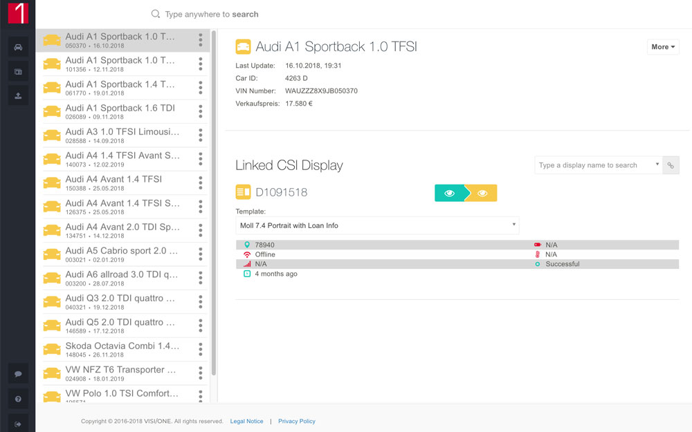
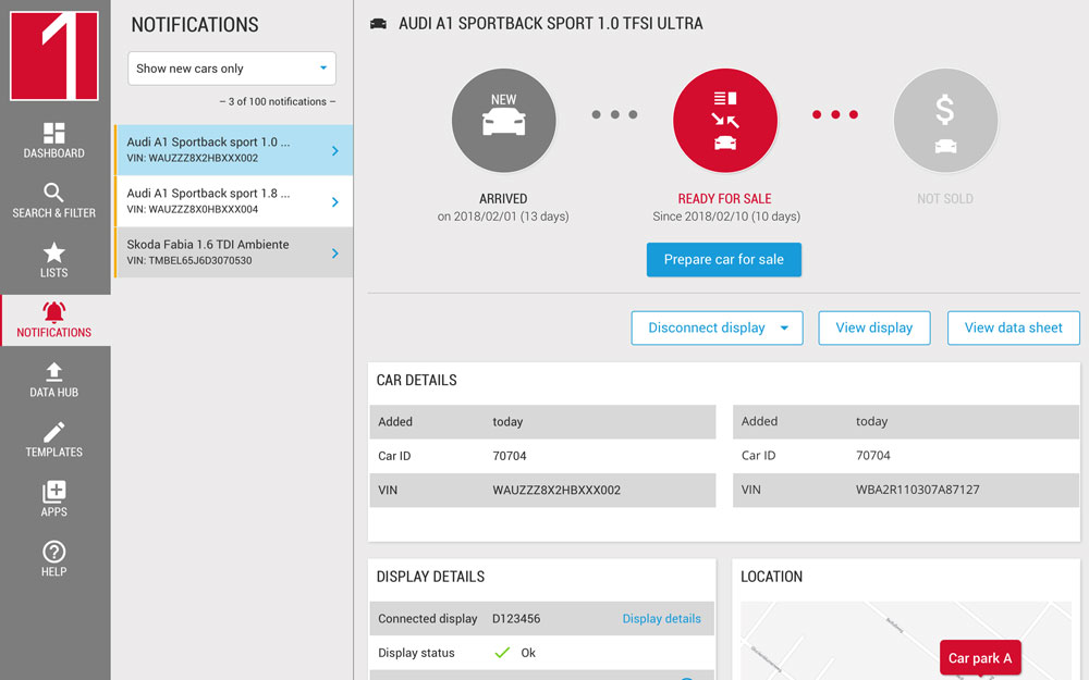
We redesigned the B2B application so that they could really take off with optimized user flows and improved usability. The goal was to create a flexible interface that they can build on for a long time to come and that also offers a great user experience. With our agile approach and lean, tailor-made processes perfectly suited to their requirements and working methods, we convinced them that were the right partner for this project.

Facts about the project
| Customer | VISI/ONE |
| Product | Application for digital price labelling |
| Duration | 2.5 months |
| Method | Interface conception and design |
| Result | Wireframes and visual UI design |

The process: Designing an intuitively
operated app in only 4 iterations
How we were able to unite user needs, business requirements and
technical characteristics
When designing the new app, we fully adapted to the development rhythm of VISI/ONE: With 4 iterations in 2-week cycles, we jointly developed a prototype that is not only user-friendly and intuitive to use, but can also be flexibly extended and adapted to all future developments.
The iterative process allowed us to discuss ideas and create a mutual understanding of the product, technical limitations and business goals. The final concept thus takes into account all technical specifics and unites user needs with business requirements.
By internalizing the requirements and goals of VISI/ONE, we were even able to generate some ideas that went beyond the original objectives: For example, we added a feature that makes it possible to determine the success of individual salespeople and the entire car dealership. By tracking the car status (arrived, not ready for sale, ready for sale, sold), optimization potentials in the sales process can be discovered, so that downtimes are minimized and thus the sales profit is increased.
In the final step of the project we gave the concept its final touch: Our simple and unobtrusive design supports user-friendliness and ensures a pleasant user experience. The clear specifications of the associated style guide enable VISI/ONE to continue to design future elements in a consistent style. And all this, of course, in consideration of the corporate identity of VISI/ONE.

With the requirements of VISI/ONE
we generated targeted ideas.
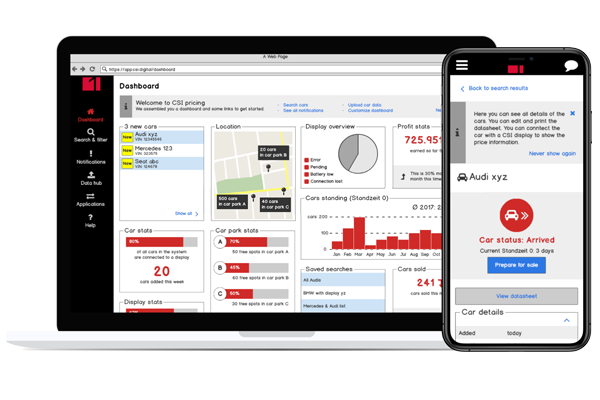
Beginning with wireframes like this one, we iterated towards a user-friendly prototype of the application.
The result: Impressive application with business focus
Flexibly expandable interface with great user experience
The result is a user-friendly, cross-platform app with a great user experience and target-oriented design. Furthermore, the concept is perfectly optimized for mobile use: There are no functional differences between the mobile app and the web application.
The concept was subsequently implemented by VISI/ONE in its entirety and is now constantly being further developed.
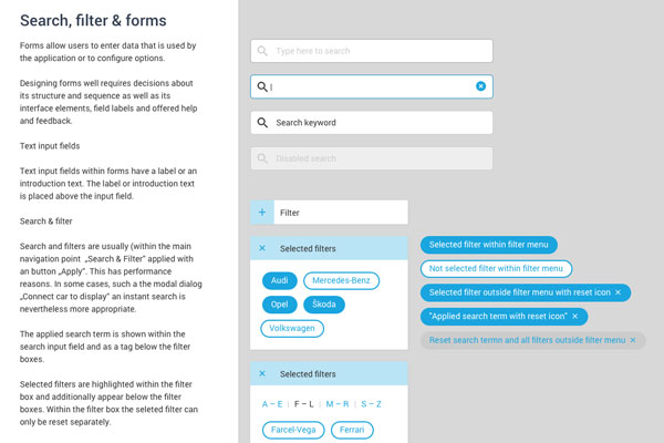
The style guide is helping VISI/ONE to program and develop their app
And this is the result in before and after comparison (Pull me!)
So says the customer:
“Creative-efficient work”
“Such an individual and fast familiarization with our product and its technical features cannot be taken for granted – our contact person from Userlutions has managed exactly that. Creative-efficient work, sound UX expertise and services on top: We are now implementing your concept in its entirety. Thank you very much!”


Markus Schrickel, Head of Product,
VISI/ONE
The conclusion: Sustainable design pays off
The new design helped VISI/ONE to focus on a product that had organically grown beyond its limits and to make it even more user-friendly. The consideration of future developments makes the concept sustainable and business oriented.
Want to learn more?
Do you also need support with designing a new product or do you want to make your existing product more user-friendly? We offer both the conception of prototypes and the design of the user interface. Have a look at our portfolio or contact us if you have any questions:
How can we help you?
We offer free and non-binding consultations

Birgit Bärnreuther
Head Of Consulting
030 / 544 870 24
(Mo to Fr, 9am to 6pm)
We recommend using your work email – it keeps work and life seperate.
